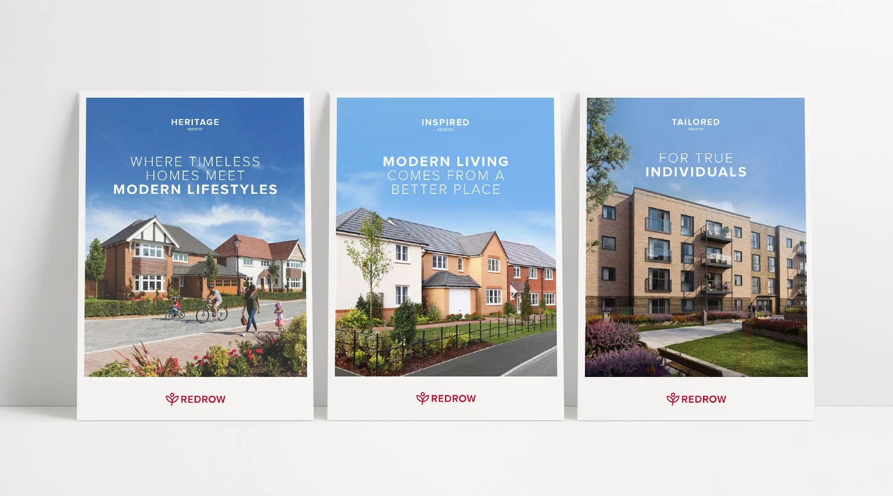
Redrow – Brand Refresh
What if your brand doesn’t line up with the high quality homes you sell?
-
Whilst the homes Redrow sells and the service they provide is premium, its brand was overcomplicated and didn’t quite match up to their products. We knew Redrow needed to take a step back, before it could move forward.
We kicked things off with an in-depth brand and customer landscape audit. We looked at every aspect of the Redrow brand and all the customer touch points. We conducted development site visits in London, Midlands, Yorkshire as well as more locally in the North West. We also did a mystery shopper exercise with Redrow customers and some competitor analysis.
What we found were inconsistent styles overcomplicated by too many components. As well as a brand which was missing a cohesive, engaging brand personality and an emotive tone of voice.
The brand re-fresh was built around the concept that Redrow doesn’t just sell homes, they sell a lifestyle.
This led to developing a brand around their core strapline – A Better Way to Live, a bold statement which almost reads as a call to action. Allowing Redrow to be more emotive and engaging with its tone of voice.
When it came to the visuals, instead of adding on, we stripped back, taking a less is more approach.
-
M.Y Role: Lead Creative
—
Creative Director: Simon Allman
Senior Creative: Rob Clayton, Dave Entwistle & Sarah Dutton
Creative: Sam Donlan
Copywriter: Tony Price
Client services: Paula Smith
Account Manager: Sarah Dungar
Artworker: David Nightingale
Animation: Mike Ash & Rob Lomas
Photography: Ben Spriggs


